31 October 2005
East meets West on Halloween
Happy Halloween, everyone. This really is a great holiday, and the only one that I have really mourned over the last several years. Outside the US, one can scrape together a pretty decent celebration of practically anything else, but abroad, there is no door to door trick-or-treating, not jack-o-lanterns on front porches, nothing. My children have no clue that they ought to be very envious of what awaits every child in America tonight.
When I think of Halloween, the last thing that comes to my mind is Ancient China. But, China has been on my mind anyway, and with today being Halloween, I put the two together. All month the Kennedy Center has sponsored a Festival of China, so I recently dug up my old text books from a class on the arts inspired by Zen and Taoist teachings. In one of them, I found what I think is a perfect poem:
Withered vines, aged trees, twilight crows.
Beneath the little bridge by the cottage the river flows.
On the ancient road and lean horse the west wind blows.
The evening sun westward goes,
As a broken-hearted man stands at heaven’s close.
This is an example Chinese Dramatic verse, a poem by Ma Chih-yuan (1270-1330) created upon the tune of T’ien Ching Sha. The poem has been expertly translated to preserve the rhyme concluding each of the five lines. Lyric poems such as this one are known by the name of the tune they are set to, and are not considered untitled even though they are not given a name beyond that of the tune.
It is noteworthy that the tonal patterns in this poem would have provided much interest in the original language. In line one the tones are exact opposites of what they are in line three, and the second and fifth line are tonally identical. The symmetry and repetition of this pattern, although difficult to convey in English, would never the less have reinforced and given further unity to the message of the poem.*
What is that unified message? Well, the scene is of fall, of sun-set, of old trees and an ancient road. The horse is lean and the man is beaten down. They are in no condition to withstand the wind, and even the crows might be a threat to them. The poem overflows with signs of decay and death. There is something inevitable about the scene. I don't imagine anyone would read it and think, "Oh cheer up broken-hearted man! Tomorrow is another day." The finality of the scene is reinforced by the river continuing its course as well as the unrelenting wind and the progress of the setting sun. The fact that he is broken-hearted seems natural considering the landscape in which he is placed, and his presence gives as much information about the setting as the landscape does about him. Although all that is said of him is that he is broken-hearted, we sense that the surrounding environment tells us much more than this.
And that brings me back to Halloween. The culture I grew up in doesn't typically look death in the face. It prefers obtuse euphemisms to blunt statements of reality. I frankly think we as a culture are terrified of anything we can not control or change, hence the distance we craft between ourselves and that universal human reality. Halloween stands as a potential exception to this--a chance for a little make-believe.
*I owe all the background information about the poem and the translation to James J. Y. Liu's The Art of Chinese Poetry.
30 October 2005
The Pharmacist
 This painting is currently located in the Apothecary Museum within the Heidelberg Castle in Germany. It was on the circuit of places to take visitors before we moved to Lebanon. We see Jesus in the role of Apothecary. Before him are emblems of faith, hope and charity, beneath which is a paper reading "ask and ye shall receive . . . " In the jars behind him on the left are various virtues; grace, eternal life, spirituality. On the right, a depiction of Jesus healing a blind man. An Apothecary's scales are held in his hand, doubly indicating the weighing of souls and the weighing of various treatments.
The painting was completed in the early part of the 1700s in Austria. I'm not sure I understand how to read the message of this painting, and I have two competing guesses. The first is, "The church will heal you so don't bother with that phony quack down the road." After all, Jesus is shown administering faith hope and charity to heal rather than the herbs or other medicines a 1700s pharmacist would have had. My second guess is, "Just as the Apothecary helped you out with that nasty case of lock-jaw, Jesus helps you out of the spiritual darkness you've been struggling with." The reason this interpretation appeals to me is that Apothecaries were part of the community. They weren't heretics or, worse, Alchemists. It seems likely that the painting is simply drawing a ready-at-hand analogy.
If that is the case it seems to show a changing point of view within the church toward science and change. This painting seems to indicate a church and a public that, rather than burning down the pharmacy and the pharmacist, is willing to adapt Christianity to a changing world. It seems that they found a way to relate contemporary changes to existing doctrine. We tend to hear almost exclusively about the animosity between religion and science, but this painting makes me wonder what they really thought 300 years ago.
29 October 2005
Art Education
The LA Weekly recently ran this article by Aaron Rose called The Kids Aren’t All Right: Is over-education killing young artists? His central point is that the art establishment is churning out over-educated artists, far too geared to the art world than the real world. To quote:
Young MFAs are required to read endless texts, many written more than 20 years ago by stuffy Frenchmen with navel-gazing theories holding little or no relevance to life in Bush’s America. They are then asked to somehow relate their work to these deconstructionist theories and then be judged by how successfully they do this.
The primary problem with this kind of education is that by diving deeper and deeper into the theoretical and self-referential, artists lose touch with their public. As a result, the public, particularly the young public, often feels alienated from art.
I’ve got a few problems with this assessment.
1. Rose is arguing that reading and responding to philosophy materially damages the ability of an artist to communicate with the public, whereas I think any artist who hadn’t read these texts would be woefully unprepared to defend the relevance of his/her work. To claim that the writings of Derrida, Lyotard, or Baudrillard (the stuffy Frenchmen?) drive an untraversable wedge between an artist and the public is laughable.
2. Navel-gazing? Maybe. But these men were also writing about the condition of our times, our society, our progression as a civilization. In other words, far from being irrelevant, these texts were written in reaction to us, and in some cases, predicting with great accuracy our future. Any art worth the price of the materials to make it ought to be able to hold its own in the presence of these writings.
3. Ahem. When was the last time that the public felt spoken to by contemporary art? How far back do we have to go before we find art that did not alienate the majority? You certainly have to go back to the days before modernism, and once you go that far back you find yourself in a world in which art was the province of the rich and educated only—a very restricted audience not unlike the one we have today.
Lament all you want that art has lost its power. Cry over the sad and sorry state of the art world. Curse the bifurcated realms of art and life. But don’t, don’t blame education.
28 October 2005
Eero Saarinen
A while ago I said I would at some future point write about interesting architecture. Well, folks, here it is. The architect in question, Eero Saarinen, is responsible for this:

The photo credit goes to Ezra Stoller, who has a well-deserved reputation as a photographer of modern architecture. This is the TWA terminal at what is now JFK airport in New York. I'm pretty sure that when I moved away from the US I departed from some other terminal at JFK and never saw this one. So that's one more place to see. . . .
I've always admired the interior, the way it curves and bends. And I also like the architect's philosophy that even the smallest detail is part of the whole and should be treated as such. When I look at pictures of Saarinen's terminal, I am irresistibly reminded of a cave and of the Jetsons. It has a marvelous "this is what they thought the future would look like back in the past" feel.
Saarinen is also the architect behind the Jefferson National Expansion Memorial--more commonly known as the St. Louis Arch, which incidentally was completed on this day 40 years ago.
27 October 2005
Italo Calvino and decorative books
One of the books I have recently read is Italo Calvino's If on a Winter's Night a Traveler, published in 1979. It reads like a grab-bag of literary styles from the late 70s.* Each time the protagonist gets his hands on a book it somehow vanishes after the first chapter. As he searches for the rest of the book he finds another, even more interesting book to pursue. Along the way, while confronting many of postmodernism's conundrums, he meets a person, Irnerio, who doesn't read at all--who deliberately unlearned the skill of reading. I'd like to have him try my test.
Anyway, later in the book, the protagonist bumps into him again, and they have the following conversation. The protagonist is waiting in the home of a mutual friend, Ludmilla, when Irnerio walks in and starts looking for a book. Beginning on page 148, protagonist speaking:
"I thought you never read."
"It's not for reading. It's for making. I make things with books. I make objects. Yes, artworks: statues, pictures, whatever you want to call them. I even had a show. I fix the books with mastic, and they stay as they were. Shut, or open, or else I give them forms, I carve them, I make holes in them. A book is a good material to work with; you can make all sorts of things with it."
"And Ludmilla agrees?"
"She likes my things. She gives me advice. The critics say what I do is important. Now they're putting all my works in a book . . . A book with photographs of all my works. When the book is printed, I'll use it for another work, lots of works. Then they'll put them in another book, and so on."
For all I know, making art out of books was a completely original idea in 1979. It is possible. Anyway, it seems that even if one isn't using books as a medium, books are never the less very important.
 Ann Hamilton's installation Tropos, for example, featured among many other things, a reader steadily burning out the words of a book as s/he read. At first I really wanted to know which book was being destroyed. It seemed very important to know which text was being banished out of Hamilton's carefully crafted environment. But from everything I have read it really doesn't matter.
That seemed really strange to me, and it still makes me wonder a bit. Like most of us (or so I would imagine) I am accustomed to words being very important, and to have a book at the center (literal if not figurative) of a work and have it not matter what that book was or what was written in it . . . well, lets just say the idea takes a bit of getting used to. Meaningless text is a major postmodern theme and so I guess it fits.
Books as a vehicle toward an aesthetic conclusion aren't lost on these folks though. Maybe Irnerio will give them a call.
*just a warning: some of these styles contain what some would call questionable or outright pornographic content, so don't take this post as a blanket endorsement of the book.
26 October 2005
Art spam
I don't count posters, and no, I don't count porn. Sorry. I'm sure that comes as a big surprise.
 I didn't know that there was such a thing as art spam, but lo forth and behold: This guy, Thierry Ehrmann, has either finally sent spam to someone who will read it, or has recently added art to the long, long list of spamable things. The spam tells me that he is behind artprice.com. I've been aware of the site/company for about five years, because I remember trying to find the going price for Japanese woodblock prints when I was an undergrad. Too bad only members can search. Anyway, although the picture makes it look like he is operating out of his basement (and desperately going for the matrix look) they must be successful enough. I mean, they are publicly traded on the Paris sock exchange, so I assume. . . .
Anyway, the art world has gone a-spaming, and they aren't just hanging a shingle out either. Nope. They are capitalizing on the death of Arman. He died less than a week ago and his funeral will be held tomorrow in New York. The spam included a link to information on how Arman has been doing at auction, along with a short list of the works they represent.
Art has edged very slowly into technology. For example, though I can think of few subjects that lend themselves more easily to distance learning that art history, it is still difficult to find on-line or correspondence degrees in that field. So, maybe it is a good thing that there is now fine art spam, especially if it indicates a general trend. Even if it doesn't, I'd rather get spam about this than a home mortgage.
25 October 2005
Unity Temple
Frank Lloyd Wright had what Neil Levine called a "moral scripture" above the hearth of his family home:
Truth is Life,
Good Friend, Around These
Hearth Stones Speak No Evil
Word of Any Creature . . .
Nineteen years after that home was build, Wright abandoned his family and took up with the wife of a former client. There weren't any proverbs above the hearth of the home he built with her.
During the years before all that happened Wright built Unity Temple in Oak Park, Illinois.

It was completed in 1908, and went against many of the established conventions of American church-building. Incidentally, 1908 is the same year the Model T was introduced. Juxtaposing those two images helps the contemporary viewer to understand how innovative and even strange Wright's design was. Just about everything about the church is atypical. The congregation met in square space rather than the traditional oblong basilica. In a rather clever way, the entry to the chapel was behind the pulpit, hidden from view of both the speaker and the audience. There were innovations too in Wright's choice of materials, use of space and light, and so on.
Someday, I hope to have a long layover in Chicago (or maybe a long weekend in Chicago) so that I can go see this building for myself.
24 October 2005
On Size and if it Matters
An American Sculptor named Donald Judd once said, "If something new is to look important it has to look like something that has become important, which takes time." Judd's statement, initially published in 1984, seems to ring true. I've chosen an example that spans a couple millennia. Thousands and thousands of years ago, the ancient Egyptians started making obelisks. There are a lot of them still around today. They are scattered all over--Paris, Rome, London, either because they were taken by those who attacked Egypt over the years or because Egypt started giving them away as presents.
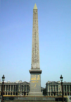
This is the obelisk the Egyptians gave Louis Phillip in 1836. It stands in Place de la Concorde in Paris. There's one in the Vatican too, directly in front of St. Peter's. That obelisk was likely brought from Egypt during Rome's days of empire, and was put in its present location in the 1500s. Anyway by the time the US decided to memorialize George Washington, the standard was set. Paris had obelisks. Rome had obelisks. And now, America would have one too. In 1848, construction began on Washington's monument, an obelisk after the Egyptian tradition--but BIG.

The garden variety Egyptian obelisk stands about 25 meters tall. Not the Washington Monument though. It outshines these little babies by a good 145 meters. Ok, we get the point.
America does overstatement really well, I think. They say that imitation is the sincerest form of flattery. Maybe so. The official reason for Egypt's gift of an obelisk to the US in 1880 was for helping out with the Suez Canal. But I think they probably felt a bit sorry for us too.
23 October 2005
War art
Art has taken war as subject matter for as long as there has been art (exactly how long that is remains up for debate). Think of the Hellenistic Dying Gaul or Trajan’s Column. War ceased to be central subject matter at about the time artists decided that they didn’t need any subject matter. So there's a chicken-or-the-egg debate for you.
During the 1800s, artists painted dramatic scenes of combat and uprising, spoils of war, victory, defeat, etc. These paintings were sometimes critical, other times supportive of the crisis at hand. Frequently of monumental scale, these works universally convey the importance of the subject matter, the heroism or villainy of the individuals depicted. War was serious, important business, and art knew it.
I do not know if there are such paintings of the first World War. Maybe there are, but if so, I’ve never seen or heard of them. Many artists who personally experienced the horrors of the first world war returned to their easel and brushes with disgust, anger, disillusionment, and trauma. Their images ache with the pain of innocence lost. They didn’t paint the importance of war, but the personal (or impersonal) consequences of it.
However painful the reality of the first World War was, it could not compare with the second. All of Hiroshima and Nagasaki disappear in a blinding flash, millions of European Jews are systematically exterminated, suicide pilots on death missions and so on. How, pray tell, are you going to represent that in the prim art of painting? Picasso painted Guernica, but I don’t know that anyone else even tried. Faced with all that, I think I’d choose non-representationalism too. It is a simpler solution.
22 October 2005
From Exhibit to Museum
Yves Klein is a pretty well known Modern artist even though his professional career lasted only 8 years. Of all the innovative things he did in that short time (fire painting, marketing thin air, employing people as paintbrushes) he is best known for color: specifically International Klein Blue, his own patented trademark color.
In the late 1950s and ealry 1960s, Klein made the following sculpture.
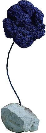
Well, he made this sculpture along with flocks and herds like it. What you are looking at is a seasponge, suspended on an iron wire atop a rock. The sponge, of course, has been marked with Klein's famous IKB. These little sculptures appeared in Klein's exhibits alongside his other work. According to Nancy Spector, "the sponge sculptures—all essentially alike, yet ultimately all different—formed a forest of discrete objects surrounding the gallery visitors."
This piece is about a meter high, and it makes a difference that it was not displayed on a pedestal, that it did not stand alone. Amid so many of it's fellows, this sculpture created an environment in the gallery, perhaps an early form of installation art.
Here, and probably in the Guggenhiem as well, the sponge is alone. To get a good look at it and to prevent gallery goers from trodding on it, it would be best to put it up a bit higher than one meter. But doing that (exhibiting it alone and out of context) changes a lot about what Klein wanted this sponge to do.
I don't have a problem with that. Art is shown out of context and out of character all the time. In fact, reproducing the Artist's intended environment isn't always possible or desirable. For the viewer, the challenge is to recognize this and keep open the possibility of a very different approach to each work.
21 October 2005
Art History: Problematic situation #1
If you are the kind of person who likes to think of history as “solid, believable, verifiable fact” you won’t like what I have to say today.
History generally, and art history specifically evolve and change. Their priorities realign, and things previously believed insignificant become central to historic discourses. In other words, as our present evolves, we sometimes find that the historical events we thought were shaping and directing our future actually weren’t. Sometimes there was something else going on in the past that we hadn’t seen before that actually turned out to be the most important thing of all.
When that happens, we go back and rewrite or revise history, because what we though was in fact important, in fact wasn’t.
And, oh my, has this happened in art. The following two paintings were each completed by Frenchmen in 1880. Both images have classical nudes and semi-nudes. Both are of traditional mythological subject matter. But the painters’ style is nothing if not dissimilar.
The first is by Bouguereau, a master of academic painting and a favorite at the French Academy’s exhibitions.
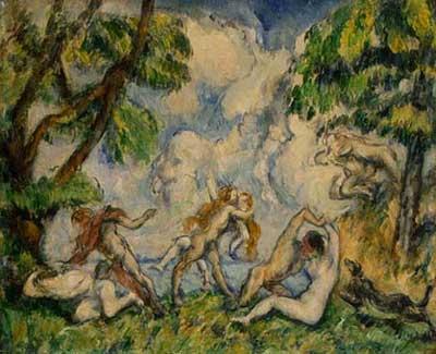
The second is by Cezanne. Unlike Bouguereau, Cezanne wasn’t an Academy favorite. But he was one of Picasso’s favorites. During the first half of the 20th century, histories of art glossed over Bouguereau and lauded Cezanne because Cezanne’s work was relevant to the developments of Modern Art.
Since the 1960s, Bouguereau has regained some of the old glory. Over the last 40 years, art history has made an effort to recognize movements and artists that contributed to other events, not just the long and, increasingly austere road to High Modernism.
20 October 2005
The difference between Looking and Reading
Here's a fun little exercise. Time yourself as you say the names out loud of each of the colors in the table below.

Now try a similar exercise. This time, there aren't blocks, but words. Don't read the word, but say the name of the color of the letters. Time yourself for this one as well.

If you are pretty good at English, it will probably take you much longer to do the second set than the first. Why is that? Well, it takes a lot of effort for the brain to suppress the inclination to read. As you go through the second set you have to keep shutting that tendency out.
I'd be interested to know if the same thing is true of pictographic languages, but I'd guess that it is.
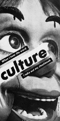
Anyway, there's always a bit of a problem of priority when images are mixed with words. In the past, the title was used to clarify the image, or direct the viewer's attention to a certain aspect of it. The potential for tension between title and image caused some artists to choose not to name their pieces at all. Other artists have chosen to exaggerate the situation by mixing images and text. The following is a good example of this: When I hear the word Culture by Barbara Kruger, 1985.
19 October 2005
An American Artist
This post is for my sister. Happy birthday.
Just about everyone recognizes American Gothic, by Grant Wood. It has been parodied and pastiched endlessly, and it rightly qualifies as an icon of Americana. I don't know how I feel about American Gothic. Every time I see it I want to giggle, even though the piece looks serious enough. This year a book was published about it, and I heard a review on NPR that made me think of several paintings by Grant Wood that I really like. I'll put two in today's post.

The Metropolitan Museum of Art owns Wood's The Midnight Ride of Paul Revere, 1931. I like that the viewer looks down on this scene from about the height of the church steeple. I like that the lights have gone on, even in the distance. I love the way the rectilinear buildings contrast with the landscape's undulations. I also really like how the whole scene looks like it has been hit by a spotlight (look at the church's and horse's dark shadow).
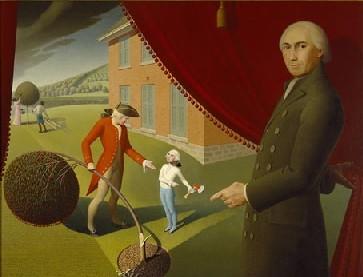
This one is called Parson Weems' Fable, from 1939. I love this one because it is just sooooo silly. Here we have Parson Weems drawing back the curtain to show his fable about young George Washington chopping down the cherry tree. Remember the story? George was so honest that he lived up to his crime, right? I love that the curtain is edged in little cherry-like pom-poms. The tree is so stylized that it too looks like a giant cherry. As for young George, it looks like Wood borrowed his image on the dollar bill--the face of an old man on a little boy. Again, the deep shadows reinforce the theatrical, imaginary aspect of the image.
Happy birthday, Kathleen. I hope you like these paintings, or at least find them amusing.
18 October 2005
Pimp my Carriage
Ayn Rand's The Fountainhead was one of the first books that I read because I wanted to, unassociated with any kind of school assignment. The protagonist, Roark, is an architect--a visionary, rogue, Avant-garde, etc., and as such has a hard time getting commissions. The following discussion with a prospective client begins on page 164:
"Mr. Janss, when you buy an automobile, you don't want it to have rose garlands about the windows, a lion on each fender and an angel sitting on the roof. Why don't you?"
"That would be silly," stated Mr. Janss.
"Why would it be silly? Now I think it would be beautiful. Besides, Louis the Fourteenth had a carriage like that and what was good enough for Louis is good enough for us. We shouldn't go in for rash innovations and we shouldn't break with tradition."
"Now you know damn well you don't believe anything of the sort!"
"I know I don't. But that's what you believe, isn't it? . . . Tell me, Mr. Janss, do you really think that Greek columns and fruit baskets are beautiful on a modern, steel office building?"
Just so that we are all on the same page, here is a carriage not unlike the one Roark describes.

Angels, garland, and lions were a great way to soup up your wheels anywhere between 1700 and 1830. At the time The Fountainhead was written (1946), the best ride around was probably a Bentley like this one.

And today, you know you’ve arrived if you have a playstation, flat screens, and at least one hydraulic powered flip out thingy in your car.
The discussion in Rand's book has stuck with me ever since I first read it, mostly because it has applicability to about 12 different art topics. Whenever one of them comes up this passage pops into my head. Today, I'll limit the discussion to taste. Simply put, taste, aesthetics, beauty, and so on change. It is very tempting to believe that there is a universal beauty out there that touches the soul of every man and woman on earth. When I encounter something of immense beauty I can scarcely comprehend that any one else wouldn't feel what I do. But there always are people out there who don't. Universal aesthetic appeal is a myth.* While this may be disappointing, it opens up worlds of fascinating inquiry into why we like what we do.
*I can think of two possible exceptions to this rather fatalistic pronouncement: nature and children. But people don't design those things. They just come beautiful without help, which is different. And I regretfully speculate that their appeal isn't universal, though I wish it was.
17 October 2005
Fashion and art
Is fashion art?
Ok, that is a much bigger question than I deal with in these tiny snippets I publish each day. It demands a clear idea of what art is, a clear idea of what fashion is, and a very clearly delineated comparison of the two. Fashion and art have been compared endlessly in recent decades, and it is not as if the two have nothing in common. But I'm not here to write about what makes them the same. That's only too obvious as evidenced by all the people out there saying how fabulously interconnected they are.
Although there are many differences between fashion and art (and differences too between how the two fields function and evolve), I'll only mention one difference here. Interestingly, this difference may seem too obvious to merit discussion at all. Yet it provides a fundamental incongruity between fashion and art. Fashion, even in its most extreme forms, is designed with the assumption that it will be worn. It operates in tandem with human bodies.
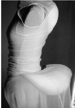
Even the extreme designs of Rei Kawakubo (above, Dress becomes Body becomes Dress, 1997) are created in view of the body as the pre-existing template of creation. The body gives origin (if not a purpose) to fashion. As such, fashion operates within a construct quite foreign to artistic production. Fashion is inextricably attached to the body, a limitation fine art has never had. It is true that both fashion and art are to some extent dependent on a viewer, but fashion remains dependent on both a viewer and a wearer.
16 October 2005
Modern Artists, Religious Architecture
I’m not nearly as interested in architecture as I am in art. Not that architecture isn’t fascinating; it is. But it takes a lot for me to get beyond the do-I-like-it-or-not point with architecture. I get hung up on whether or not I would like to be in a certain building, which I guess is not too different from those people who evaluate contemporary art based on what it might look like hanging above their couch. That’s really not the best way to judge a work of art, and I suppose my approach to architecture is equally insufficient.
There are some works of architecture that really grab my attention. Among them are buildings designed by artists. Because it is Sunday, the examples are churches. Because I am Mary Ann, my examples are modern.
The first is the Rothko Chapel. It is located in Huston Texas, and is about 34 years old. It is minimal, non-denominational, and filled with the works of Mark Rothko. Technically, Mark Rothko isn’t the architect, but he was involved in every stage of the building’s design and production. It functions not only as a chapel, but also as a museum, performance hall, and lecture forum.
The second is the Matisse Chapel. It is located in Vence, France, and is about 54 years old. It is a Dominican chapel, and Matisse personally designed every last scrap of it. Religious services are still held there.
Neither chapel strikes me as being particularly impressive as architecture goes. Even my limited appreciation of architecture is sufficient to deduce that. When compared to other “interesting” architecture, it is clear that these chapels are woefully simple, and it is certainly the artist’s involvement that is to blame for my interest in them. Also woefully simple is my appraisal of them, that though I have never been to see them, I think I would like to. I think I would like to sit down and just be there for a while.
I’ll write something about interesting architecture in the future.
15 October 2005
Something old, something new
Back in 1997, Art Nouveau was the reason I was interested in Art History. There wasn't anything that I did not admire about the swooping lines, the mass-production-ready design, the democratic sensibility of art for the masses, and the assertion that there was no difference between the fine and decorative arts.
Education changes many an opinion, and a lot of what I believed in 1997 now elicits multiple footnotes, annotations, and apendices. While Art Nouveau hasn't retained all the dreamy magic I once believed it held, I still love the way it looks. The thing that I love is that, despite the fact that most Art Nouveau pieces are over 100 years old, they still look modern, new, fresh, young, etc. Take this sculpture for example:

The attenuation, the twist of the stance, the limbs and torso that seem to drip and pool like pulled taffy--I love it. This little bronze saytr was made in 1902 by Thomas Theodor Heine.
14 October 2005
Artistic Intent
Here's one of my daughter's finger paintings.

It is one of my aims to be a culturally sensitive parent and another to expose my children to a wide variety of artistic expressions. What better way to introduce a child to the arts than through direct involvement making them? Enter finger paint! I love the hands-on, unmitigated access to the medium that finger painting provides. Of course, this is ideal for small children who, in any case, lack the technique for the tools formal painting requires.
So, we added finger painting to the rotation of activities that our kids enjoy. I found out pretty fast that Star didn't get a few essential things about this activity. She wasn't looking at her paper for example. "Look at what you are doing!" I told her. "You can decide where you put the colors and which colors you use. Don't look at me, look at the paper!" I was getting frustrated by this whole thing. And then it hit me. No, she doesn't have to look at the paper. No, she doesn't have to choose where the colors go or which colors she uses. Didn't we cover this in art history in the very first semester? Wasn't the whole Dada movement aimed at denying intent? Didn't the Surrealists love the unconscious because it freed them from having to mean something?
I'm not too sure that the Dada and Surrealism movements actually succeeded in creating art without meaning, or that such artists actually worked without intent. But I have revisited the rules for finger painting in my house.
13 October 2005
High art, Low art, and Not art
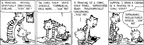
This is one of my all time favorite Calvin and Hobbes cartoons. It was originally published on 20 July 1993--a good 30 years after the whole high/low thing really got cooking during the Pop art movement. Here's a thought I've had about the whole "is it art?" question.
Sometimes it is a question of whether a thing is fine art or something else (design, folk art, craft) and sometimes it is a question of being art or just being nothing. In other words, there are examples of many thing that are not typically considered art that really seem to qualify. These things might be created as something else, as fashion, as handicraft, as decoration and so on, yet they function well in the capacity of art. Or maybe they are created as art, yet remind the viewer powerfully of design or craft. Quite apart from this are those things created as art that don't really function as anything else . . . and I think these are two different questions. "Is it art or is it something else?" and "Is it art, or just nothing at all?" are the two questions that relate to the following works.
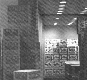
This is a picture of Warhol's Brillo Boxes, Corn Flakes Boxes, etc. from 1964. If this isn't art, it's plagiarized, "reappropriated" graphic design.
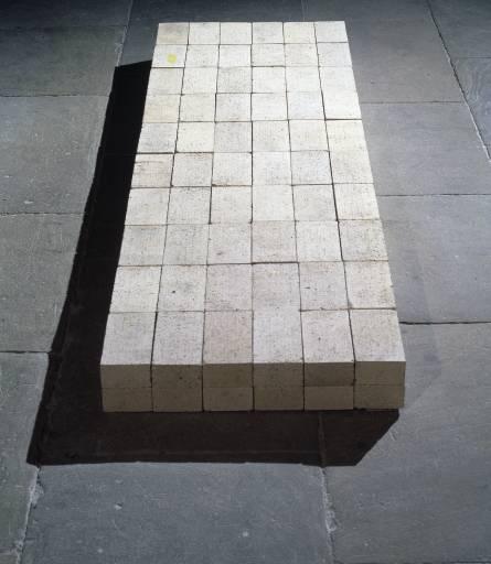
This is Carl Andre's 1966 piece called Equivalent VIII. If this isn't art, its a pile of bricks.
I see a big difference between these two pieces and the boundaries of art they address. Sometimes there is something else for "art" to be, and sometimes there isn't.
12 October 2005
What I really want for Christmas this year
Here's a fun fact about mid-career Andy Warhol:
In 1968, a short-on-cash assistant produced a new series of silkscreen paintings, forged Warhol’s signature, and made a deal with a gallery. All of this transpired without Warhol’s knowledge, who found out about the paintings only when the gallery owner asked for authentication of the works. Warhol authenticated them, but directed the gallery to send the check directly to him--too bad for the assistant.
The actually-fake-yet-authenticated Warhols were of Che Guevara, and I have to hand it to the assistant who dreamed up the idea. In 1968, Guevara was already dead, so it went along well with Andy's earlier death thing. Guevara was also iconic, legendary, and Andy certainly had a fame thing. Furthermore, Warhol went through a period of work devoted to Communist imagery: the famous Mao pictures and the hammer and sickle images easily come to mind.
So the question is this: are they really Warhols when Warhol didn't have anything to do with them except say they were his? I'd love to know what these actually-fake-yet-authenticated pieces are worth. I'd love to know if they are available. And I'd love to have one for Christmas this year.

Since that wish is not likely to come true, I'll settle for one of these shirts instead.
11 October 2005
Fine Art and Death
I've been re-acquainting myself lately with the work of Sally Mann. The more I read about her most recent exhibit (the series What Remains) the more interested I have become in the ideas it is built upon. This series of photos has to do with death and the aftermath of it. Death, dying, and the dead have been around as fine art subject matter for a long time. I’ve compiled the following short list of common death themes in art history:
a. Religious—death and resurrection
b. Memento mori (and all the morbid stuff it entails)
c. Noble death— death of Socrates, Marat, other heroes
d. Death of the enemy—dying Gaul (which is also symbolic death)
e. Romanticized death—depiction of dying beauties/lovers
f. Struggle between life and death—war scenes, mythological, historical, etc.
g. Scenes of murder (Judith & Holofernes)
h. Horrors of dying, Munch’s Sickbed, others like it
Mann’s use of, or response to death seems to represent a major departure from the foregoing list of way artists have dealt with it as subject matter. Particularly in the past (I am still exploring this point) death seems to have always been employed in some kind of massive statement about life, society, history, religion, etc. It is my opinion that Mann’s work doesn’t do any of this. What Remains seems to address death without putting it to any moralizing task.
10 October 2005
Chris Burden
Not too many people know about Chris Burden. He's been around in the art world for decades now, and I rather like what I know of his work. Back in the '70s his career centered on various life-threatening performance stunts. He electrocuted himself, got shot, etc. During the '80s he did this far less personally painful piece:

All the Submarines of the United States of America, represented in miniature and hanging from the gallery ceiling. It is an impressive piece, one that even my husband likes. During the late '90s, Burden worked with Erector Sets: sketching, constructing, and photographing. Fun and an interesting continuation of the earlier theme.
I'm interested in Burdon right now because of the whole self-destruction thing he was into in the beginning. I've been looking for critical writings about that phase and I admit, I haven't gotten anywhere yet.
09 October 2005
Fine Art and Religion
In the western world, fine art and religion used to be fast friends, comrades in arms, peanut butter and jelly. They had a dynamic, symbiotic relationship, each informing the other's practices. Consider an obvious example: Michelangelo's Pieta, one of the classics of Renaissance sculpture.
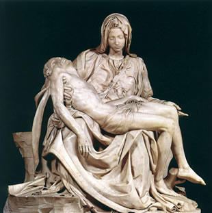
The real thing in St. Peter's in Rome is unexpectedly small, one might even say diminutive. Certainly it is dwarfed by the immensity and grandeur surrounding it. Mary is seated, the lifeless body of her sacrificed son cradled on her lap. The prevailing high renaissance style is obvious in the deeply carved folds of drapery, the perfect stability of the triangular composition, utterly naturalistic anatomy, and flawless execution in marble. Likewise, religion provides all of the symbolic weight and emotional impact of the piece. Mary not only weeps for her son, but for the world he was to redeem. She is not shown in her role as goddess of heaven, the new Eve. Rather, her figure forms the foundation, the structure, the support of the sculpture. This is not unlike her role in the Catholic and other Marian churches. She is massive compared to the little man in her lap, the image of strength and stability.
Fine art and religion have long since parted company. Oh sure, you'll find the occasional overlap, but it is rare. I don't know if fine art abandoned religion or if it was the other way around. I do know that both pursuits have lost the power they held during the centuries when their efforts were more frequently united. Maybe that has something to do with it. These days, however, fine art and religion are largely the domain of the zealous few.
Subscribe to:
Posts (Atom)
