skip to main |
skip to sidebar
Here's another installment extolling Beirut's artsy side. Two years ago I strollered Star to and from pre-school each day, walking a route that took us right past a little shop called Trompe L'Oeil. Looking through the big picture window on their storefront, I could see that the shop was full of children's things. Tiny stepping stools, hangers, toy boxes, book cases, kid-size table and chair sets, etc. All wood. All painted (usually with animals and plants). I loved it, but I knew it wasn't going to come cheap, so I waited. And waited. Waited some more because that is what I do. And bought!

If they had a webpage, I'd link to it, but since they don't, here's a scan of the business card they left with me. That black streak is my hand turning the card over while the scanner took it all in.
So, back to buying things. Star and Dandelion have (for about half a year now) been in a phase where just about everything has to have a nap time. Spoons, scrubbrushes, shoes. I have even been scolded for interrupting said naps unintentionally. So I requested a doll size cradle in an effort to create less trauma for my dear little mommie-daughters. The second purchase had less to do with the girls and more to do with war-induced shortages. After the summer-war, plastic storage boxes (big ones) have been hard to come by. When you find them, they're likely to be totally expensive and flimsy. Anyway, I need more even though I already have lots. They were all in use, and the only one that I could imagine repurposing to hold other stuff was the one serving as the girls' toy box. So, to free up the tub for other storage, I got the ladies a 'real' toy box. It is exactly what a toy box ought to be: huge with a lid, and hinges that prevent said lid from smashing fingers. Ah, perfection.
NY fashion week begins in a few days. Today WWD ran a 15 web-page article on the current push within the NY fashion industry to encourage ‘healthy’ models—discouraging those who are too young, too skinny, or both. Their move has been preceded by more concrete action in Milan, where regulations are in place requiring models to have a body mass index no less than 18.5 (the lowest ‘normal weight’ BMI) and be at least 16 years old. Regulations have not been introduced in the US, but the mere suggestion that they might be got 15 pages worth of fashion-professional backlash, with designers, models, their agents, advertisers, magazine editors, etc. all pointing the finger at the other guy. Designers insisted that they don’t care what a model weighs—just so long as she has the ‘right look’. Models scoffed at the notion that they might not ‘naturally’ be so thin. Agents swore that they would fill the demand for not-so-skinny models if there was one. But there isn’t. Advertisers claimed that they’d already been avoiding stick-insects, opting for ‘fitness’. Same goes for editors. And all of them blamed Hollywood. Since neither has a monopoly on showcasing underweight women, lets just leave that as the chicken-or-the-egg conundrum that it is.
I don’t really care if they regulate this aspect of the fashion industry or not. My personal feelings about the super-skinny prevalence in fashion has little to do with its practical aspects. And the current popularity of the very tall, very skinny look has some practicality to it. For example, tailoring around curves is much harder than tailoring their absence. It simply takes less work to fit a thinner, flatter figure. Thin figures also do a better job of disappearing under the clothes. When a model walks down the runway, you don’t want the audience thinking “oooh, look at that figure!”. Nope. You want them to focus on the clothes. So you go with a body type that on its own isn’t that impressive. As for the height, it too serves the presentation of the clothing. Details of construction and design are more apparent on a tall figure than a short one.
Although they follow some of the same meta-trends (charted over centuries and millennia) fashion and art are rarely alike. Oh they both involve 'artists' realizing a 'vision', and they both have aesthetic elements. And they both exist in rather insulated worlds that interface cautiously and rarely with the 'real' world. As I’ve pointed out elsewhere, fashion can’t get away from the body. It needs it. The body reflects on fashion and fashion on the body. Art? Comparatively, bodies don’t have a thing to do with it.
In rhapsodies of praise for its “inner living quality”, George Rowley wrote of Mu Ch‘i and his Six Persimmons (ink on silk, 13th c.), in his book Principles of Chinese Painting. Here's a scan of the rather poor image in the book:

“Mu Ch‘i can paint six persimmons upon a square foot of silk so that the tensions between them seem to be inexhaustible. Not only is each circle of fruit perfectly adjusted to all the others by the equilibrium of the intervals, but the measure of those intervals is accentuated by the ideographic stems in black ink and strong brush which unmistakably mark the distances and the rising and falling movement within the group. Rightness of interval, furthermore, is bound up with the shapes of the motifs. What nuances arise from the full round curve of one persimmon and the flattened contour of another in relationship to the distance between them!” (pgs. 6 & 59)
Hmm. I actually would like to know what nuances arise, because I’ve missed it.
Rowley’s book was published in 1947, with a second edition in 1959. That goes a long way toward explaining why he used words like “perfect” and “rightness” to describe the composition and placement of the fruit. These words have long since fallen out of favor, at least in the context of formal analysis. Also, note that Rowley failed to describe why these particular persimmons are such a famous example of Chinese painting. Instead of proving the matter, he no more than declares it to be so. We know that he sees inexhaustible nuance in the relational-placement of the fruit and that’s about all.
One of the biggest reasons to be upset by Rowley’s failure to explain the underlying principles of Chinese composition is that most viewers will need to be shown how to recognize ‘perfection’. I doubt many of us intuitively see it or comprehend it. I know I don’t. In my very first art history class I was shown these two quatrefoils, by Ghiberti and Brunelleschi. The high-relief sculptures were these artists’ entry in a competition for the honor of designing the east doors of the baptistery of Florence (around 1400):

Our lecturer asked us to guess which quatrefoil won, and went on to explain that composition had a lot to do with who won and who lost. Can you pick the composition with greatest ‘rightness’? That day in class I chose the wrong one, and honestly this is an exercise that I still have trouble with. Although I have long since learned to recognize western art’s conventional appearances, I still vividly recall when I couldn’t see it at all.
Just over four months ago, the summer's war ended and we returned to Beirut with a big fat layover in London. With the kids in tow there wasn’t much to do but wait and keep them happy, which we did. By the time our flight boarded I was kind of brain-dead, but not too much to appreciate a rather insightful ad-campaign by HSBC, a British bank self-proclaimed to be “the world’s local bank.” That they have branches enough in Beirut seems to indicate that they’re managing.
Anyway, because of this international focus, their advertising frequently highlights the differences among the cultures of the world. The implication is that because we humans are such a diverse bunch, you really do need HSBC to navigate all the madness for you. But let’s put their conclusion aside for the moment and just focus on the first clause—we humans are such a diverse bunch. Returning to the scene in the airport, where I first saw the ad-series, I had to agree that there was wild disagreement among many of us about lots of things. Consider these two examples, which I think are ideal illustrations.

As I walked through the jet way I saw probably a dozen of these. I was impressed. The ads each reduce a debate—each one a matter of taste—to its most irreducible form.
 Simple images and words show this flawlessly and concisely. There are quite a few ways this “irreducible form” can be expressed in English: one man’s trash is another’s treasure, to each his own, etc. People aren’t crazy for liking shoes we don’t or for loathing the food we adore. But imagine if this idea was elevated to something more significant than one’s taste in music. Ooh, look, you don’t have to imagine.
 Here’s one I created based on the HSBC originals, none of which were controversial. But you could do this with a seemingly endless number of hotly debated subjects, and I think the end result would be the same. Well, except that at some point, most of us would opt out of the “to each his own” reaction. In complete honesty, I would doubt the sanity (well, more likely the intelligence and exposure to information) of anyone who thought either Nasrallah or Bush was any kind of hero. In both cases, I’d be much more sympathetic to (though unconvinced by) the terrorist argument.
Terra sent us a lovely box of surprises a few months ago, which included two sets of flashcards to help kids learn numbers/counting and words/spelling. We were going through them the other day, and when we got to this one, I asked Star how many wheels the wagon had.
 She said three. For a moment I had no idea what to say or how to respond. She’s right, of course. There are only three wheels in that picture. But wagons have four wheels. They just do.
Realism. It’s probably art’s most problematic ‘ism’ for exactly the reason Star illustrated. Can the flashcard picture be said to be realistic with only three wheels? It looks enough the way a wagon might from that angle, but that view of it doesn’t show all that the wagon is. It is, if anything only partially representative of a wagon’s reality. When it comes right down to it, what should realism mean?
Was it realism when Monet tried to paint light the way it actually looked? Was it realism when Courbet rejected painting’s conventional composition in favor of a more jumbled ‘real’ look? Or was it realism when artists, more than a century ago, started looking at fruit bowls and bathers from three or four different places and rendered each of those views on a single canvas. You could argue (and Star would likely agree) that they were being more real, truer to the whole reality of the depicted thing.
Instead of calling something realistic, we art-farts tend to call it ‘representational’, 'photo-real', 'hyper-real', 'naturalistic', etc., because realism means so many things that it in the end means nothing.
Back around Christmas '05, I had one of my favorite art books re-enter my life and blogged about it here. The following exercise was taken from that book, Communications: The Transfer of Meaning.
"To most of us, this is a pretty familiar scene. So familiar that we may tend to feel that we see more in it than is there for us to see. Try answering the questions below and see how you come out."
 "Which of the following statements are true, false, or cannot be answered at all?"
1. The Jones family owns a TV set
2. Johnny is doing his homework while he watches TV
3. Johnny's father is a stockholder.
4. The screen is showing a scene from a Western.
5. Mrs. Jones is knitting a sweater.
6. Mr. Jones is a cigar smoker.
7. There are three people in the room.
8. The Jones family subscribes to TIME, LIFE, and FORTUNE.
9. The Jones family consists of Mr. Jones, Mrs. Jones and Johnny.
10. They have a cat for a pet.
11. They are watching an evening television show.
I'll post the answers right here tomorrow.
--update 25 Jan 2007--
And now for the answers, by the book:
1. You do not know that the set is owned by them; it could be borrowed, or a demonstration set.
2. You do not know whether Johnny is doing homework or not; all you can see is that he has a book in front of him.
3. You do not know that Johnny's father is a stockholder; you only know he is looking at the stock market report. Matter of fact, you don't know he is Johnny's father, either. He may be an uncle or friend just visiting the house.
4. You do not know that it is a Western. It could be a commercial or a foreign-made movie, or almost anything else.
5. You do not know that it is Mrs. Jones, and you can not tell what she is knitting.
6. You do not know that Mr. Jones (if, indeed, that is Mr. Jones) actually smokes cigars. You only can see that there is a cigar on the ashtray. Perhaps someone else left it there.
7. You do not know how may people might be in the room; you can only see that there are three people in the part of the room shown in the picture.
8. You do not know what magzines they subscribe to. The ones on the table may have be purchased at the newsstand or loaned by a friend.
9. You do not know if this is the Jones family; nor can you tell if there are other members of the family who are not present.
10. Could be a neighbor's cat, making itself "at home."
11. You cannot tell if it is evening or not; only that the lights are on. Perhaps it is midday and the shades have been drawn.
I collect paper:
 And I obviously love patterns that frequently repeat.
I have never once thought of my paper collection as anything other than; a) evidence that I am a packrat, b) a reflection of my taste and whimsy, and finally c) a waste-not-want-not aesthetic and world view that has thus far prevented me from actually spending money on pretty paper. I don't see these as art, even though they are all artfully done.
What, then, does this have to do with art? Probably not a whole lot. It might go a long way to explain my taste, preference for contemporary art and geometric patterns. It might not.
But confessing my paper-collecting mania provides a convenient opportunity to discuss the difference between the scraps that appeal to me and the very different reality of art. One of art's problems that comes up again and again is the difference between designing something and making art. Rephrased, the difference between arts and graphic arts. The two have enough in common to confuse things. Looking at the papers in the image, you can tell they didn't happen by accident. Each one of them was designed by someone who chose each color, shape, where it would appear on the page, etc. There is an element of deliberate, intentional, conscious doing within graphic arts, all aimed at creating an appealing end result.
Art, on the other hand, has questioned the need for deliberation, intention, for conscious trying. I have also come to expect art to provide at least something to think about. All of the paper in my collection is decorative only. Even though it wasn't made to make me think, it does. If it inspires any intellectual thought, it is this: some papers more successfully reach the intended purpose of the paper. Some of the papers are security envelope patterns. YES, I saved envelopes if the inside was pretty. The harmony of their design and function is interesting to me, especially that one with the word EXECUTIVE printed in the interwoven lines. Here you've got a paper (third from the bottom) that tells you not only what it is for, but who as well. Whenever form and function meet in spectacular (or even above-average) fashion, you'll end up having a discussion about high and low art. Fine and applied art. Art and craft. Blech. But I like it anyway.

They're all called David.
From left to right youve got Donatello 1428-1432, Verrocchio 1465-1470, Michelangelo 1501-1504, and Bernini 1632. That they all appear to be looking to the right is an odd coincidence. If you click the picture you'll be able to view a much bigger, lovelier image.
Anyway, what you see up there is 200 years worth of Florentine self-conceptualization. David, the city's symbol, certainly went through a lot during those years. He grew up for one. Donatello's bored, navel-gazing little boy ends up as Bernini's feisty hero, one good twist away from slaying Goliath and losing his delicate drapery. I have no idea what Verrocchio was thinking. David looks down-right feminine, like a cheerleader. After the first two, your first thought on seeing Michelangelo's might be "Where's the decapitated head?" The first two are self contained statements: David victorious. Michelangelo's David looks to the left, preparing to cast the stone. The statue is directed outward, only depicting half the story. Same with the Bernini. David's posture implies that Goliath is on the receiving end of his sling.
Shortly after Dandelion was born (a mere 20 months ago) I was up to my eyebrows in the highly theoretical texts that eventually lead to my thesis. As I read and reread, I found myself looking up the same words again and again. So, I started keeping track of them, and whenever I read I refered to and updated my list. Some of these words are now very familiar and I actually use them without feeling strange or somehow dishonest. Others are so new to me that I still forget what they mean without my handy list.
Here is a short version of my list; the words you definitely need to know to read about art:
Agonistics: The science of athletic combats, or contests in public games.
Bifurcation: Forked or divided into two parts or branches, as the Y-shaped styles of certain flowers.
Countervail: To act against with equal force; counteract. ~or~ to compensate for; offset.
Desideratum: Something considered necessary or highly desirable
Diachrony: Change occurring over time.
Elide: To omit, cut short, abridge, eliminate, strike out.
Fealty: the fidelity of a vassal or feudal tenant to his lord
Hegemony: The predominant influence, as of a state, region, or group, over another or others.
Hermeneutic: Interpretive; explanatory.
Heterogeneity: the quality of being diverse and not comparable in kind
Heuristic: Of or relating to a usually speculative formulation serving as a guide in the investigation or solution of a problem
Metonymy: A figure of speech in which one word or phrase is substituted for another with which it is closely associated, as in the use of Washington for the United States government or of the sword for military power.
Obscurantism: A policy of withholding information from the public.
Paralogy: False reasoning; paralogism.
Performativity: optimization of the global relationship between input and output, the true goal of a system.
Polemical: Of or relating to a controversy, argument, or refutation.
Polysemic: having more than one meaning; having multiple meanings
Quixotic: Caught up in the romance of noble deeds and the pursuit of unreachable goals; idealistic without regard to practicality.
Reifying: To regard or treat (an abstraction) as if it had concrete or material existence.
Shoah: The mass murder of European Jews by the Nazis during World War II
Sublate: To negate, deny, or contradict.
Sublimation: An unconscious defense mechanism in which unacceptable instinctual drives and wishes are modified into more personally and socially acceptable channels.
Synaesthetic: a concomitant sensation
Telluric: of or pertaining to the earth: terrestrial.
Vituperative: Using, containing, or marked by harshly abusive censure.
One of the things that they tell you you can do with a degree in Art History is pursue a career in Art Law.
I've decided that you'd be better off studying law.
The other day, I came across The Art Law Blog, which is maintained by a NY law firm specializing in copyright, non-profit organizations, media, and art too.
Anyway, just knowing The Art Law Blog is out there is of great comfort to me. For a while, I thought it would be a good idea to make a list of all my favorite artists-getting-sued cases out there, because they raise very interesting questions about authorship, reputation, originality, and so on. Turns out they've got the present pretty well covered.
I suppose I could still compile a list of my favorite historic law suits. And who knows, maybe I will.
Today I’m not much for pontification. This stunning image (swiped from my sister’s blog) depicts the even more stunning (splitting hairs?) art of Dale Chihuly.
 Between Christmas and New Year’s when everyone was together the whole family went to the St.Louis Botanical Garden to see the installation he currently has there. Back in 2005 there was a similar “glass in the garden” display in London. I saw a short segment on CNN about it, envied a friend who got to see it in person, and now, envy my whole family because they’ve seen something equally impressive right in their backyard.
I’ve seen Chihulys in real life only once (or possibly twice--I’m forgetful) and that was certainly a “stumbled over it in my backyard” kind of experience. Anyway, it’s just one more reason to wish I was there.
Even though he’s not my favorite artist, Andy Warhol does provide good fodder for Impart Art, and for contemporary art generally. One of the very first installments of Impart Art described a short-on-cash assistant who in 1968 produced a new series of silkscreen paintings, forged Warhol’s signature, and made a deal with a gallery. As planned, all of this transpired without Warhol’s knowledge, who found out about the paintings only when the gallery owner asked for authentication of the works. He claimed them as his own, as well as payment for them (surely the assistant was disappointed).
In 1969, another assistant told the press that she had been doing all Warhol’s art for over a year. Warhol, she reported, had given up art. When asked by Time magazine about the matter, Warhol confirmed the report, only to retract the statement when infuriated collectors and dealers heard the news.
Can an artist outsource, and if so, how much? I know it isn’t uncommon among contemporary artists to hire skilled painters with good technique to execute ideas on their behalf. As far as I know, the painting is still considered the work of the one who thought of it. And let’s face it. Warhol wasn’t really “painting” anyway. So what if it was his arm working the silkscreen machine? But here, if you trust the assistants, Warhol wasn’t involved at all. His participation amounted to nothing more than his saying so. And he might not have even done that much if the buyers hadn't been scandalized.
I was rummaging around on-line today and came across this book all about the wonderful world of ambigrams--a word that reads the same if you rotate it 180º. A good, simple example is the little word pod.
 Photo credit
The book is called Wordplay, by John Langdon, who is something of an ambigram genius. The title as pictured is itself an ambigram. Of course, in whatever font Impart Art uses, Wordplay fails to look anything at all like itself when flipped upside down. Thus the art (or is it the science?) of ambigrams. To be able to tweak each letter just enough that it could double for something else upside-down is an amazing feat. Not saying it is Art, but an art for sure.
As for Art upside down, you’ve always got George Baselitz.
 This is his “Tulips”, 1981, as it appeared in my one-painting-per-day 2003 calendar. Yes, I kept all the pages and in mint condition too.
Flipping words upside down is pretty entertaining, but an upside down image has other connotations. His work raised all kinds of questions about art and the art world. Had it been stood on its head? Some have said that Baselitz wanted to present recognizable things, but also keep the viewer from losing sight of the paint-and-canvasness of any painting. It really is harder to relate to an upside down image, and so you are more likely to notice color, form, composition and less likely to think about who knocked over the tulips.
And now, for the real treat of the post, upside down music. Years ago in middle school, there was a mini-concert during orchestra (third hour, I think). Two violinists, both decent and a year ahead of me, played a duet. They stood facing each other with a single sheet of music placed between them on a table. The one on the left played what he saw from top to bottom, as did the player on the right. In other words, the duet was a single set of notes played right-side-up and up-side-down at the same time.
It is attributed to Mozart, but apparently that is in question. Those of you who want to download a free copy of the duet can do so here. Scroll down until you see the German title “Der Spiegel”, in English, The Mirror.
Sometimes, when I’m driving or otherwise bored, I design t-shirts and bumper stickers in my head. On one such occasion, I designed this:
 . . . and ever since I’ve been trying to figure out if calling something Bourgeois is an insult.
Turns out it is, at least in some circles:
In the rhetoric of some Communist parties, "bourgeois" is sometimes used as an insult, and those who are perceived to collaborate with the bourgeoisie are called its lackeys. Marx himself primarily used the term "bourgeois", with or without sarcasm, as an objective description of a social class and of a lifestyle based on ownership of private capital, not as a pejorative. He admired the industriousness of the bourgeoisie, but criticised it for its moral hypocrisy. This attitude is shown most clearly in the Communist Manifesto.
(Wikipedia: Bourgeoisie)
Because there is a whole Marxist approach to art criticism (read more about it here, and original sources here)bourgeois is a term I've had floating around in my brain for a while. Before looking it up, I knew of lots of artists who had derided the bourgeois, but also knew that the term basically just meant "middle class". I’ve already acknowledged that I've got a bunch of stuff in my head that I know far too little about, and what I know is generally from the wrong angle. My knowledge of Marx is sort of like what I’d expect the average football enthusiast to know about sewing a sports jersey.
Anyway, I’m still wondering about that idea for a shirt. If I wore it, do you think anyone would understand it? Would anyone feel insulted? Would you wear it? Why or why not?
If you don't get the title, don't worry. I didn't really get it for a long time too.
But then I was driving early in the morning years ago in Utah. There was no one else on the road, and you know how you can see for miles in some places because the valley is so flat. I was at one of those spots where I knew there was no one at all. Anyway, I came to an intersection and the light was red, so I stopped. When it turned green, the following thoughts flashed through my head in very quick succession as I drove on:
"green means go" - "but it doesn't. That color is just called green (a slight distinction, I know) and it only signifies right of way in this limited context."
It was the first time that I really understood the difference between our words and their referents, that it is all a construction and none of it (except words like *BANG*) has any essential connection to the concepts/objects they signify. Why does this matter? What does it have to do with art? Well, of course there's the whole disjuncture between a picture of something and the thing itself--analogous with the division between things and the way we name them.
The thing about art is that it has, for three decades or more, been quite aware of the theory that surrounds it, and again and again, the most successful works of contemporary art are actively involved in pushing the theory onward. Cindy Sherman's myriad images of herself in disguise are a good example of art that points to the fringes where the arguments gets gray and murky and shines a light on it. Sherman's work deserves a post of its own. Maybe next time.
Back in October I went to the Art Lounge here in Beirut to see a friend's show of photographs from all around Asia. The rather large prints of her work were impressive and I now own three of them (christmas presents from my very put-upon spouse. I mean really. Who would want the task of buying me presents?). While I was at the show, I picked up a freebee postcard to go with the invitation to the show (left).
 So, since I'm all interested in the arts and I'm here in Beirut, and the two intersect oh so infrequently, I thought I'd write about the experience at the lounge. First, they aren't kidding about being a lounge. It’s basically a bar/night club with art on the walls. I've never been to any show there except my friend's, so I don't know what else they have had there, so I can't tell you about the general quality of the art side of the "Art Lounge" business. Knowing that there is a lot more night-clubbing than art-going happening in this city, I'd have to guess that they are definitely an ok lounge and as for the general standard of the art . . . who knows.
They had a nice little book/gift shop, but without any art games I went away a bit disappointed. As for the location, it is fairly easy to get to, which is not a given in Beirut. They're right off the Dora highway right at the edge of the Beirut city limits, in just the kind of place that looks just the way dangerous places in the US look. Funny how my whole visual lexicon of places to avoid has been turned on its ear in this place.
Anyway, as a viewer in the gallery/lounge, I was very aware that I was being watched. People lounging with their drinks who might glance over at the exhibition would not be able to help glancing at me too. In a dedicated gallery, you've basically got a definite visual focus--the stuff on display. Everyone is there to see it. But start putting out chairs, tables, finger food and drinks, and all of a sudden, my viewership is being included in the viewership of others.
So, its sort of a strange place--a strange viewing experience. But the lounge makes art a little less rare around here, and that's a step in the right direction.
Josh's recent posts' conflation of art and games (a genius combination, I think) put me in mind of some of my favorite art games. I've blogged about one already, a memory game based on famous paintings from the Alte & Neue Pinakothek in Munich. This was the first art game I ever owned, and it was followed in quick succession by these:
 Going clockwise from the top left, you've got a game about Renaissance paintings (thanks mom!), the collection of the Musee D'Orsay, Color (illustrated with paintings from France's major museums), and French history from pre-history to the first empire (illustrated with a wide variety of art and artifacts). These were mostly picked up in museum gift shops, and their mere existence, I think, covers a multitude of museum-gift-shop sins.
All 4 games work on the same principle: your goal is to collect all seven cards to make a set, and to complete as many of the seven sets (or families in French) as you can. This is done by asking other players for the cards you need or fishing a lucky card from the pot.
I've never won even one round of this type of game. In fact, the smallest one (about French history) made its way into our lives on the trip to Paris with Dan and Bonnie and Samantha in '03. We all played in the train on the way back to Germany, and it was shameful how poorly I did. The kids aren't quite old enough for this, which means I'm safe for the moment. Once Dandelion is old enough to not try to ingest or crumple the cards, we'll probably get a lot of use out of these, and I'll learn new lessons on facing defeat with grace.
I don't have one.
No really.
It would be like a singer having a favorite pitch (so I dearly well hope that you singers out there don't because first, it would ruin my argument and second I would think it was stupid and I'd hate to think so ill of anyone for something so mundane).
Probably most of my close relations would guess that Andy Warhol is my favorite, but that's just because I own a lot of books about him. And I've read all of them, some of them numerous times, and I've used those books in a good deal of Warhol-centric research. But so what. He's not my favorite. I don't have one. Really. What I like most is the relationship among works of art, the kinds of dialogues you can imagine (or prove in some cases) between them, the way one artist's work becomes infinitely more rich when compared with the work of another.
But for those of you who are enamored of favorites of this or any other kind, here's a link to a questionnaire of favorites, famously completed by the young Marcel Proust.
innovative: adjective
1. ahead of the times; "the advanced teaching methods"; "had advanced views on the subject"; "a forward-looking corporation"; "is British industry innovative enough?" [syn: advanced]
2. being or producing something like nothing done or experienced or created before; "stylistically innovative works"; "innovative members of the artistic community"; "a mind so innovational, so original"
This from WordNet® 2.1. Princeton University by way of dictionary.com
I've always thought of innovation as inherently good, useful, and productive (though I couldn't find any dictionary to support my sense of the word). It isn't like invention or creativity. They can be negative. Inventors come up with useles junk all the time, and we've all (at one point or another) been abused by the very annoying creativity of others. But no one ever bothers to say "positive innovation", useful innovation", or "constructive innovation", to give a few examples. To do so would be redundant, at least in our current use of the term.
Given that innovation is seen (by me at least) as relevant, needful, and good, does the ongoing story of art require anything more than this?
 If for no other reason than that I own both the books pictured at left, I am a lucky dog. The top, Handbags, and bottom, Bags, are about, duh, purses. And though they have that in common, there is little else the same about them. First, there isn't much duplicate information in them, even though they cover the same time periods, production sites and techniques. Handbags includes interviews, brief biographies, and brand histories of the best contemporary purse designers and companies. The purses are organized by style, which allows a 2001 Jamin Puech to appear directly before a rare English purse from the 1550s, emphasizing a continuity of sorts--a harmony within this genre that has endured for centuries (see pgs 264-5).
By contrast, Bags is organized first by date, beginning with the oldest surviving examples of purses. Beca use all the bags of a certain era appear together, it is far easier to imagine the time, appreciate the purse in its context. The emphasis here is on the history of the purse, whereas the Handbags emphasis was on the style of the purse. Bags also offers much more detailed information about materials, construction methods, and the historic context of each period's chosen forms. For example, this about Petit-point, lace and cloth:
Until the nineteenth century, fine needlework was performed not only by women as a home industry, but also by professional embroiderers. Partly due to technological developments, the variety of needlework techniques increased sharply. Although less very fine needlework was done at that time, there were many techniques for making reticules, such as Berlin woolwork, blackwork, lace, weaving, embroidery, crocheting and knitting.
pg 248
So, there you have it. Both are heartily welcome in my library of things about which I probably know either too much or too little. But since I don't know which it is, I'll stop here.
Way back at Christmas 2003 Matthew gave me a book making kit, and I have just now gotten around to using it. At first I was quite worried that the included glue would have passed its shelf-life. But it was still functional and so on New Year's Eve I went forward with the project. New Year’s Eve was the perfect time for this. It is the one night of the year when getting into bed late is expected. After the kiddies were snuggly in bed, I had about 4.5 hours to work.
The kit included enough materials for two books and I almost finished both in one night. The instruction booklet said to expect it to take 3 hours, but since this was my first time through the process and I made two of them, I’m content with my turnaround time. And my results aren't too shabby either. I'll post pictures later.
I now know all kinds of bookbinding terminology. The pages are placed together in groups called signatures, which are individually sewn and sewn to each other. The sewing on the fold lines is called a mull, and the pretty band that is placed on the mull at the top and bottom is called a headband. I could go on and on like this, but won’t.
The best part of the process is that I have lots of leftover glue, thread (a nice, sturdy one) and even some special papers. If I got my hands on the other necessities, I’d have the ability to make another book. I really like the idea of that. The books I made require nothing more special than 8½x11 paper and some heavy card-board for the spine and covers. I know my way around papers and fabrics well enough to be able to find buckram and everything else right here.
I've dabbled in bookbinding before, but I've never had instructions, tools or such professional looking results. In comparing my book with other hard-cover books in my house I see little difference in construction or quality, which is impressive.
Because I live in a world where on-line shopping is impossible, I haven’t used the web for that kind of thing in a while. That’s probably why I just barely found out about like.com in this Dec 27th WWD article:
Like.com, whose technology allows shoppers to find shoes and accessories using celebrity photos as the basis for search, expanded into apparel on Saturday. Unlike text-based search, where shoppers type words to describe what they are looking for, image search is based on visual properties of an item such as color, texture and shape. . . Like.com did not feature apparel . . . because the variety of ways that clothing is photographed . . . adds complexity to the task of calculating a visual signature for each item . . . Although shoes and watches are photographed in a more consistent manner, making for a simpler calculation, the visual signature for those items still contains some 10,000 data points.
I’ve got the solution for them. Pigeons. And wouldn’t you know, pigeons are also the connecting link between that brief WWD article and your daily installment of Impart Art.
Pigeons "have been shown, by Richard Herrnstein and his associates at Harvard, to be able to categorize pictures by subject, and hence to appreciate the differences between pictures of X and pictures of something else. The basic procedure was simple: the pigeons were trained on a set of slides to pick out the pictures of trees, or bodies of water, or of a specific individual, pecking one disk or the other depending upon pictorial content, and getting rewarded for being right. Once the suite of images was learned, the pigeons were shown novel instances, which they were able to classify with about the same success humans might have. . . .”
That was taken from Arthur Danto’s Beyond the Brillo Box, pg 24. And it is an interesting idea. I would not be surprised if pigeons are many factors better at this kind of work than our most advanced technologies. Pigeons could do that kind of relationship-linking and no one would have to code it. Danto described and then imagined some other advanced uses for the pigeons a few pages later:
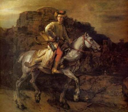 “No one that I know of has as yet trained pigeons to discriminate by style, thought here are fascinating indications that pigeons are easily up to this task. . . . Debra Porter and Allen Neuringer, of Reed College trained pigeons to discriminate between selections from Bach and from Stravinsky. That achieved, they had to decide which of five other composers sounded Stravinsky-like and which Bach-like. Without error, they classed Buxtehude and Scarlatti as Bach-like, Walter Piston and Eliot Carter as Stravinsky-like. They classed Vivaldi however, as Stravinsky-like, leaving it up to us to decide whether they were in error or instructing us in how to think about and listen to Vivaldi. My own feeling at the moment is that I would trust a pigeon more than your standard member of the Rembrandt project on questions of reattribution. I wager The Polish Rider(pictured above) will be returned to the Rembrandt canon if my pigeon colleagues are consulted."
Brillo Box, pgs 28-29.
Ok, so I'm totally sock-knocked-off impressed with pigeons and their remarkable skills and all that, but I'm not sure I trust them to listen to human-made classical music better than humans do. And though the Rembrandt Project has been troublesome in many regards, Danto's insult to their work raises some interesting questions about painting, painters, and viewers. Can a painter eventually be reduced to little more than his style of rendering? What of composition, of subject matter, of materials, of anything, really? Will a computer eventually be able to answer all these unanswered questions, or are pigeons our best hope?
I think they might be for like.com, but I don't know about the rest of it.


